


Overview
This is part 4 of a series of demo apps helping you to understand Qt 5.7 for x-platform development on Android and iOS.
You should have read the blogs about my first app using Qt 5.7 Material Style, my second app (StackView Example) and my third app (SwipeView Example) before reading on.
This time I’ll explain HowTo use a TabBar – one of the new Qt Quick Controls 2.
Coming from BlackBerry10 Cascades ? TabBar is similar to a SegmentedControl.
You should have installed Qt 5.7 RC.
New to Qt 5 development ? Please read my blog series from the beginning to learn some basic stuff and to understand this app.
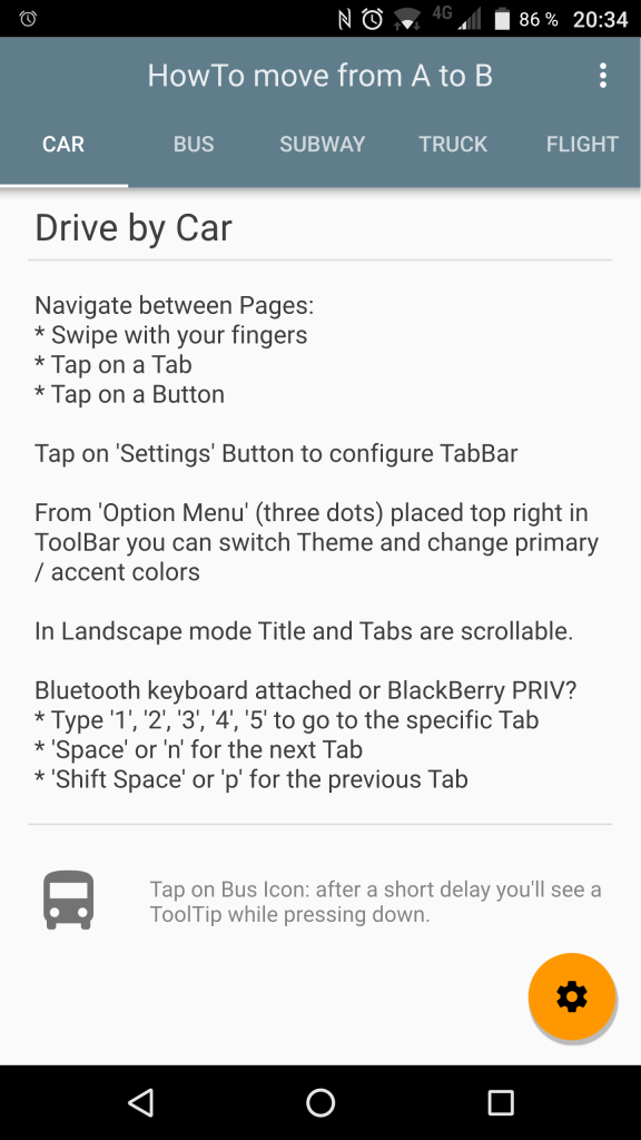
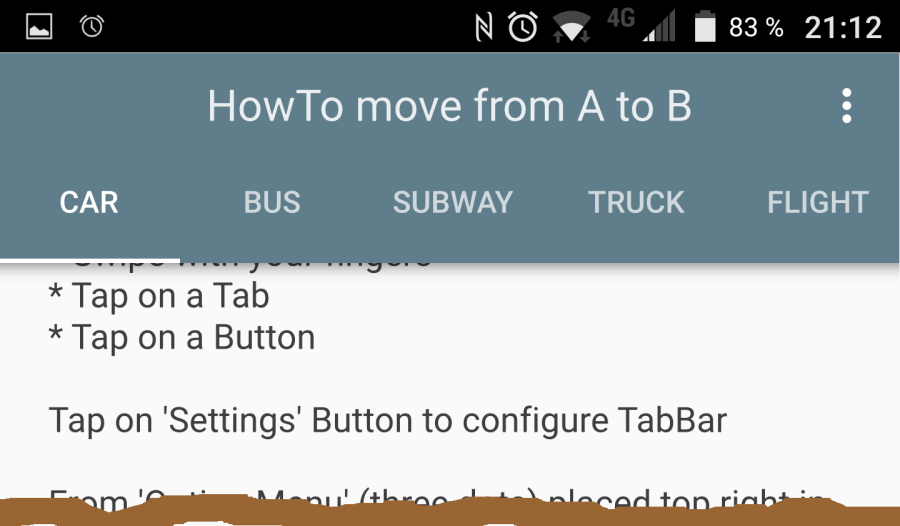
TabBar Example App:
- TabBar allows to easy navigate through content
- There are 5 Pages the User can access
- When a Page is loaded: call init()
- Before a Page is destroyed: call cleanup()
- TabBar Design can be configured from Settings tapping on Floating Action Button (FAB)
The Source
This app can be downloaded as Open Source from https://github.com/ekke/tab_pages_x
Project structure and .pro
The project structure is similar to my StackView or SwipeView Example Apps – we’re also using 5 Pages here for TabBar to make it easy for you to compare. Pages are named same as for the StackView and SwipeView apps, but sourcecode is slightly different.
The other Apps have used Raised and Flat Buttons inside Pages – this time I’m using a customized 48 dp Image Button:
ButtonIconActive {
    imageName: tabButtonModel[1].icon
    imageSize: 48
    onClicked: {
        navPane.goToPage(1)
    }
}
common/ButtonIconActive.qml:
Button {
    id: button
    // default Image Size 24x24
    property alias imageName: theIcon.imageName
    property alias imageSize: theIcon.imageSize
    focusPolicy: Qt.NoFocus
    contentItem:
        IconActive {
        id: theIcon
    }
    background:
        Rectangle {
        id: buttonBackground
        implicitHeight: imageSize + 24
        implicitWidth: imageSize + 24
        color: button.pressed ? accentColor : "transparent"
        opacity: button.pressed ? 0.12 : 1.0
    } // background
}
Popups now are in an extra Sources directory and /tabs contains TabBars and TabButtons (QML):
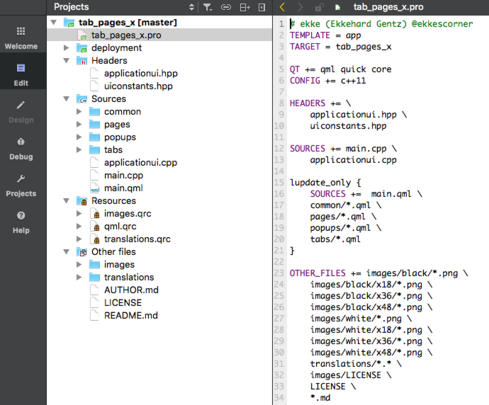
main.cpp and ApplicationUI (C++) are similar to the other apps (One Page Example App, StackView Example, SwipeView Example)
TabBar Design Choices
Google Material Style Guide gives you choices HowTo design a TabBar, Qt 5.7 enables you to implement your choice:
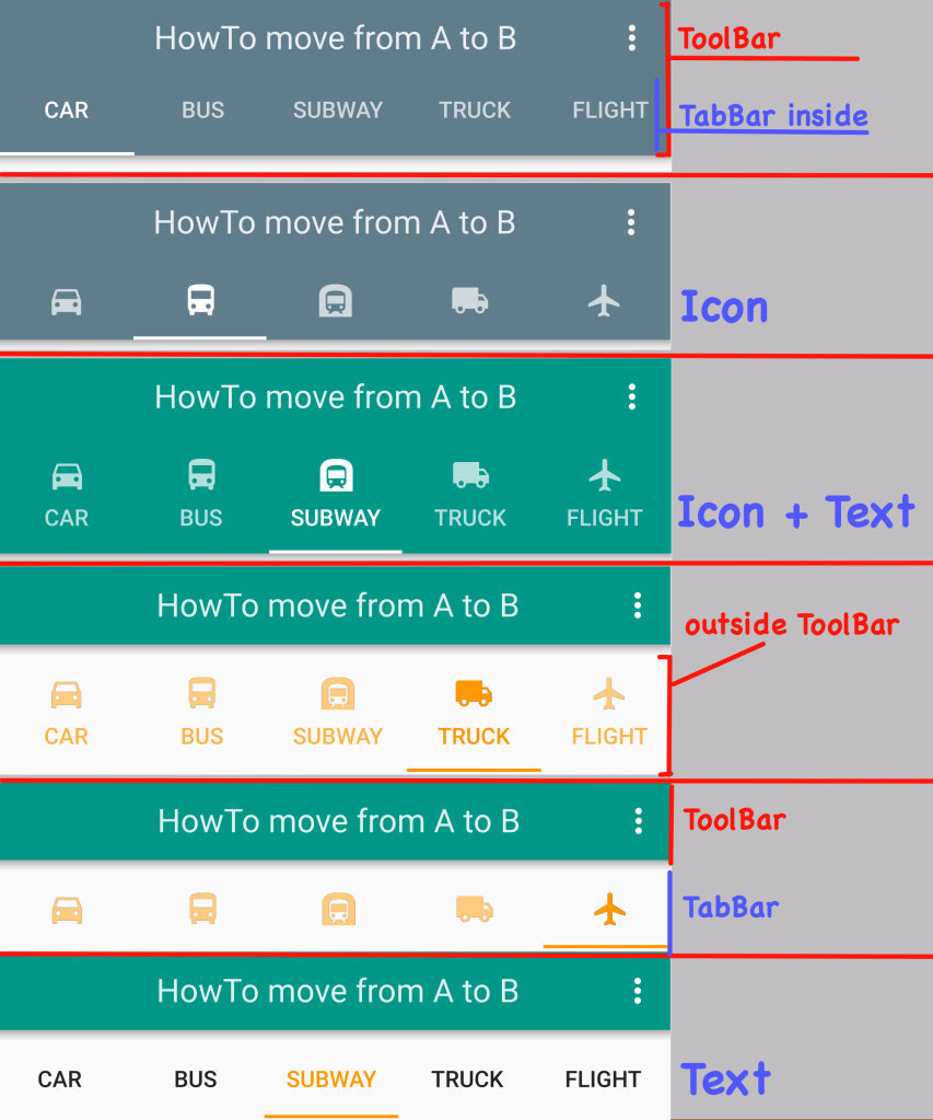
As you can see, TabBar can be part of your ToolBar or placed below, a TabButton can be done as pure-text Button, Icon-only Button or Icon plus Text. Of course you can use TabBar without a ToolBar, too.
Customizing is easy done – this is the TabButton represented by Icon-only-Design.
tabs/TabButtonIcon.qml:
TabButton {
    property color theButtonColor: accentColor
    property string theIconFolder: iconFolder
    property alias hasOverlay: colorOverlay.visible
    property real theOpacity: 1.0
    focusPolicy: Qt.NoFocus
    height: 48
    contentItem:
        Item {
        Image {
            id: contentImage
            anchors.centerIn: parent
            horizontalAlignment: Image.AlignHCenter
            verticalAlignment: Image.AlignVCenter
            source: "qrc:/images/"+theIconFolder+"/"+modelData.icon
            opacity: colorOverlay.visible? 1.0 : theOpacity
        }
        ColorOverlay {
            id: colorOverlay
            visible: true
            anchors.fill: contentImage
            source: contentImage
            color: index == navPane.currentIndex ? theButtonColor : Qt.lighter(theButtonColor)
        }
    } // item
}
Placed inside ToolBar, ColorOverly isn’t used (invisible)
Pplaced below the ToolBar, ColorOverlay tints the Image with accent color.
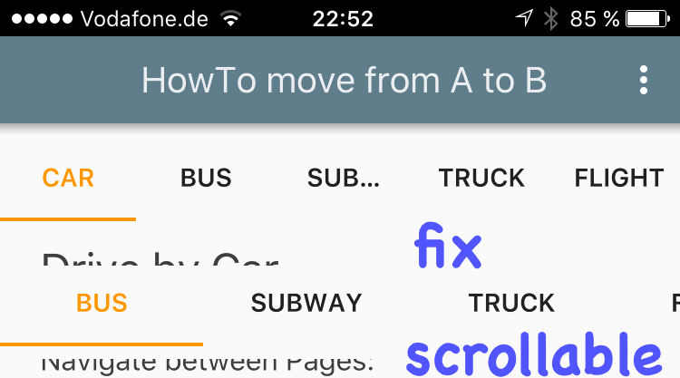
TabButtons fixed vs scrolling
Sometimes not all Buttons or Text fits into available width, so it makes sense to use a scrollable TabBar:
TabButton {
    // ...
    width: tabBarIsFixed? myTabBar.width / tabButtonModel.length
	       : Math.max(112, myTabBar.width / tabButtonModel.length)
}
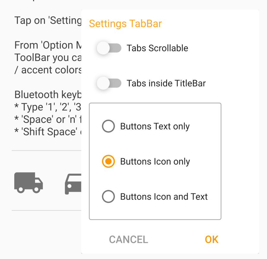
TabBar Settings (Popup)
To configure the TabBar Settings there’s another Popup:
Open the Settings Popup from Floating Action Button (FAB):
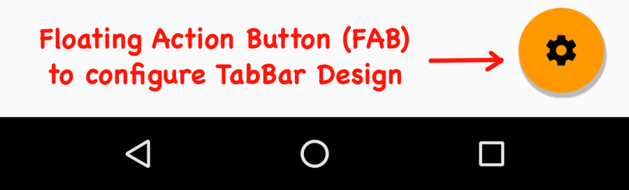
    FloatingActionButton {
        id: fab
        property string imageName: "/settings.png"
        z: 1
        anchors.margins: 16
        anchors.right: parent.right
        anchors.bottom: parent.bottom
        imageSource: "qrc:/images/"+iconOnAccentFolder+imageName
        backgroundColor: accentColor
        onClicked: {
            showSettings()
        }
    } // FAB
// ...
    function showSettings() {
        popupSettings.tabBarIsFixedSettings = tabBarIsFixed
        popupSettings.open()
    }
// ...
    PopupSettings {
        id: popupSettings
        onAboutToHide: {
            popupSettings.update()
            resetFocus()
        }
    } // popupSettings
PopupSettings used some new Controls: RadioButtons inside a Frame:
Frame {
    ColumnLayout {
        anchors.fill: parent
        spacing: 6
        RadioButton {
            id: radioText
            focusPolicy: Qt.NoFocus
            text: qsTr("Buttons Text only")
            checked: tabButtonDesignSettings == 0
            onCheckedChanged: {
                tabButtonDesignSettings = 0
            }
        }
        RadioButton {
            id: radioIcon
            focusPolicy: Qt.NoFocus
            text: qsTr("Buttons Icon only")
            checked: tabButtonDesignSettings == 1
            onCheckedChanged: {
                tabButtonDesignSettings = 1
            }
        }
        RadioButton {
            id: radioTextAndIcon
            focusPolicy: Qt.NoFocus
            text: qsTr("Buttons Icon and Text")
            checked: tabButtonDesignSettings == 2
            onCheckedChanged: {
                tabButtonDesignSettings = 2
            }
        }
    }
}
As already discussed in previous articles: To make Shortcuts work well, we set Qt.NoFocus for RadioButton.
This Popup follows a Default-Button-Concept, where ‘OK‘ is default (colored with Accent Color)
Even if user clicks outside the Popup to close, changed values will be updated:
Popup {
    id: popup
    // ...
    // default behavior for this Popup: OK Button Clicked
    property bool isOk: true
	// ...
    RowLayout {
        ButtonFlat {
            id: cancelButton
            text: qsTr("Cancel")
            textColor: popupTextColor
            opacity: opacityBodySecondary
             onClicked: {
                isOk = false
                popup.close()
            }
        } // cancelButton
        ButtonFlat {
            id: okButton
            text: qsTr("OK")
            textColor: accentColor
            onClicked: {
                isOk = true
                popup.close()
            }
        } // okButton
    } // row button
    // ...
    function update() {
        if(isOk) {
            tabBarIsFixed = tabBarIsFixedSettings
            tabButtonDesign = tabButtonDesignSettings
            tabBarInsideTitleBar = tabBarInsideTitleBarSettings
        }
    }
	// ...
}
// ...
// from main.qml:
// ...
onAboutToHide: {
    popupSettings.update()
}
// ...
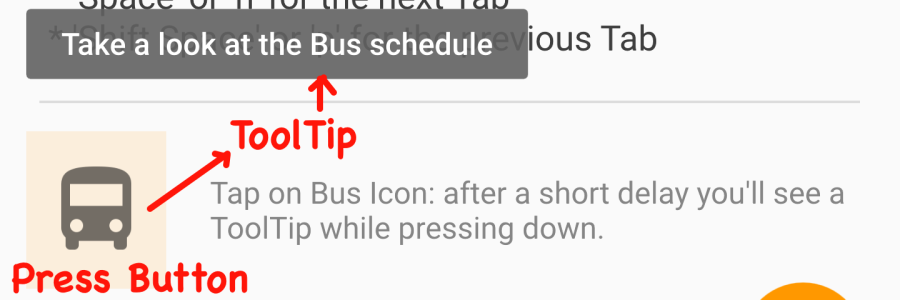
ToolTips
You can define ToolTips if you want to use this to guide your users. I have implemented ToolTip on ‘Bus’ Button (First Tab).
    ToolTip.visible: pressed
    ToolTip.delay: 500
    ToolTip.text: qsTr("Take a look at the Bus schedule")
Floating Header
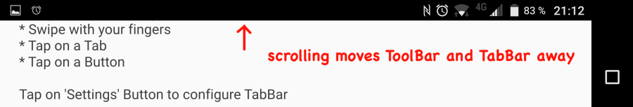
Using a ToolBar together with TabBar as ‘header‘ could occupy too much space in Landscape.
Coming from BlackBerry 10 Cascades ? In Cascades you can configure TitleBarScrollBehavior as NonSticky to make the TitleBar scrollable. I implemented something similar here.
Using a Loader this is easy done:
ApplicationWindow {
    //
    property bool isLandscape: width > height
    // ...
    header: isLandscape? null : titleBar

    Loader {
        id: titleBar
        visible: !isLandscape
        active: !isLandscape
        source: titleAndTabBarSource
        onLoaded: {
            if(item) {
                item.currentIndex = navPane.currentIndex
                item.text = qsTr("HowTo move from A to B")
            }
        }
    }
    Loader {
        id: titleBarFloating
        visible: isLandscape
        anchors.top: parent.top
        anchors.left: parent.left
        anchors.right: parent.right
        active: isLandscape
        source: titleAndTabBarSource
        onLoaded: {
            if(item) {
                item.currentIndex = navPane.currentIndex
                item.text = qsTr("HowTo move from A to B")
            }
        }
    }
}
Portrait scrolling:
Landscape scrolling:
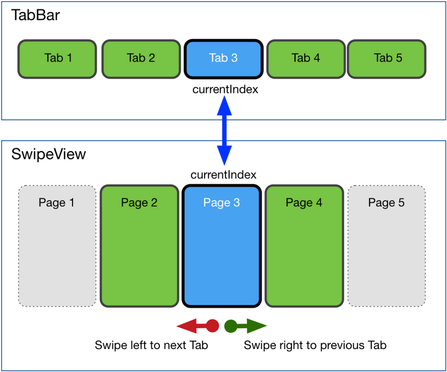
Tandem: TabBar and SwipeView
From Google Material Style Guide: You must be able to Tap on a TabButton or to swipe from content to navigate.
From Qt 5.7 TabBar: Tabs must work together with Controls providing ‘currentIndex’.
So it’s the best way to use a SwipeView to show the content and to bind the currentIndex to TabBar.
We already discussed SwipeView in detail here. SwipeView example app uses Loader to load / unlaod current Page and next / previous Pages.
For the TabBar I did it slightly different using ‘Lazy Loading‘: at Application Start the first two Tabs are pre-loaded. All other Pages will be loaded if needed, and stay loaded while App is running.
Take a look at main.qml to see how all this stuff is implemented.
To define the TabButtons first time a Repeater is used:
Repeater {
    model: tabButtonModel
    TabButton {
        text: modelData.name
        width: ...
    }
} // repeater
Coming from BlackBerry Cascades ? There’s nothing like a Repeater.
Repeater makes it easy to iterate through a data model and create Controls. In this case the tabButtonModel is designed in main.qml:
    property var tabButtonModel:
	    [{"name": "Car", "icon": "car.png"},
         {"name": "Bus", "icon": "bus.png"},
         {"name": "Subway", "icon": "subway.png"},
         {"name": "Truck", "icon": "truck.png"},
         {"name": "Flight", "icon": "flight.png"}]
Each data object has a ‘name’ and an ‘icon’ property and can be accessed inside TabButton using modelData.name and modelData.icon.
TabBar Navigation
Similar to StackView and SwipeView Examples you can go different ways to navigate between Pages with tabs:
- click on one of the TabButtons in TabBar
- click on a Image Button to go to another Page (Tab)
- click on Android System ‘Back’ key to go one Tab back to the left (this is no default behavior – ony an example what you can do with app-specific navigation)
- swipe using your fingers to go to next Page (Tab) left or right
- use Shortcuts (see StackView example about Shortcuts)
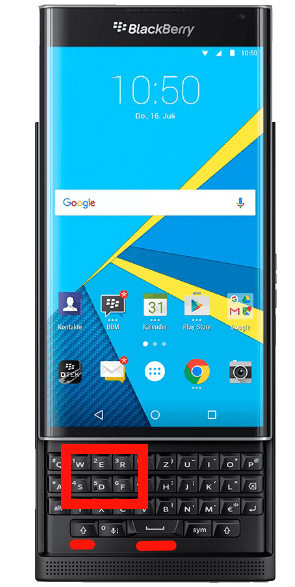
Using BlackBerry PRIV – or connected Bluetooth Keyboard Shortcuts making it easy to navigate to Tabs 1 … 5 or next / previous Tab:
Summary
You learned HowTo use a TabBar as another way to navigate through some Pages. It depends from your use-cases what will fit best your requirements.
Using a TabBar, a StackView or a SwipeView are great to navigate through many APPs. What if there are some areas you need to switch between ? Then a sliding Drawer will be the solution to manage even really complex APPs. Before taking a look at Qt Quick Controls 2 ‘Drawer’ – there’s another way if your app can be managed by 3 to 5 buttons: Google introduces Bottom Navigation as part of Material Style. The next example APP will customize Qt Quick Controls to use Bottom Navigation.

 business apps
Very nice work Ekke. New to .qml and have been fiddling with the titebar so the text updates with each page, similar to your stacked_pages_x. If you had any ideas not sure how to get something similar to {text: navPane.currentItem? navPane.currentItem.title : qsTr(“”)} working within tab_pages_x app, {property string title: qsTr(“”)} within each page’s Flickable seems to be ignored ?
Greaty work again love the style and setting abilities.
Regards
thx.
will take a look at your question next week.
Thank for good article. I’m finding how to create tab application on QT android.
In landscape mode, set header to NULL , and the loader with fixed anchors position, then scrolling up, the titlebar will be overlapped. Why? The effect looks like they are in different z axis but the code is not.
sorry – until end of year I’ll have no time to answer questions because of heavy-load of customer projects.