this article is work-in-progress

Overview
This is part 8 of a series of apps helping you to understand Qt 5.7 for x-platform development on Android and iOS. This app is not a Demo App – it’s a real life APP I developed for QtCon 2016 in Berlin. Please read the blogs about my other Examples to understand the concepts and patterns I’m using:
- First app with One Page
- StackView
- SwipeView
- TabBar
- Bottom Navigation
- Drawer Navigation
- Business Data APP
Download QtCon 2016 Conference App
The App is available at Google Play Store for Android Devices and from Apple Apptore for iPhones. Also work has started to provide a Windows 10 Mobile App.

You don’t have a Google Account and want to side-load the App ? Here’s the APK – Download – Link.

Out of the Developer Trenches
This blog will give you some insights and explain some parts of the code.
I’ll also speak at Qt World Summit about my experiences while developing this app and show what happens behind the scenes.
Here’s a short overview what I’m using to create the UI of my Qt 5.7 – QtQuickControls2 Business Apps:

There are also StackViews on top of a single Page from SwipeView:
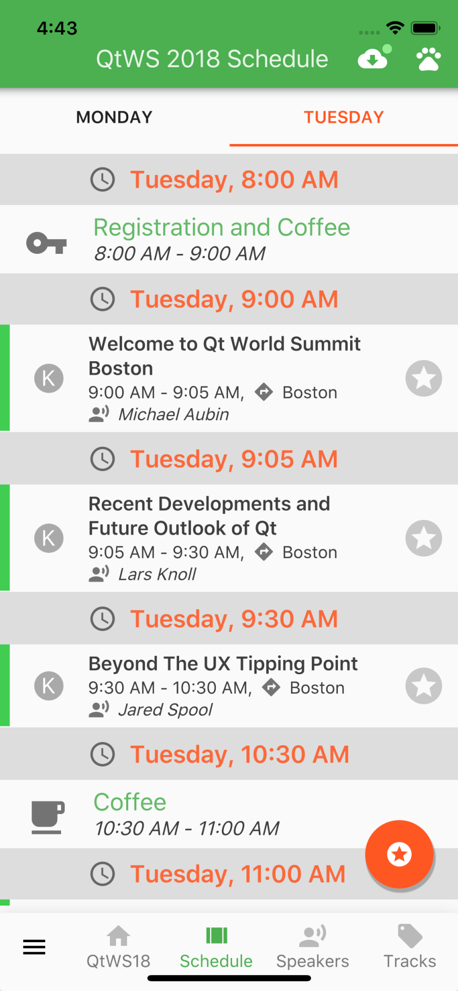
Conference Schedule is a SwipeView, each Day is a Page with ListView for all Sessions of the Day. From the List you can open SessionDetailPage (pushing on Stack) and so on.
Drawer and Bottom Bar Navigation
Main Navigation is done by a Drawer.

Now Google Material Style also supports Bottom Navigation I added a Bottom Navigation Bar to make it easier to navigate. To get the Drawer opened you must swipe from the left site or tap on the Menu Button on Top Left. The Menu Button on Top Left isn’t always visible: if pushing Pages on a Stack, the Button is replaced by a Back Arrow to navigate back – so in this case you must use the gesture from left side. Not so easy if you have a large display size or like to use your phone with one hand. The Bottom Navigation Bar enables you to go through the Pages faster without moving fingers a long distance.

There are buttons for Home, Schedule, Speaker and Tracks inside the Bottom Navigation Bar. You can reach these Buttons easy. There’s also a Menu Button (Hamburger) at Bottom Left position. This Button is always visible, which means you can easy switch between different parts of the App even if there are some Pages on the Stack.
The Bottom Navigation Bar is only visible in Portrait Mode – in Landscape it would eat too much space from available height.
Now there are two Hamburger Menus in Portrait and perhaps you don’t like to have the Menu Button at the bottom ?
No problem – you can customize this. GoTo Settings and select the way you like to navigate.
- Classic Material Navigation Style ( only the Drawer is used to navigate)
- Bottom Navigation (Bottom Navigation Bar without Menu Button in Portrait)
- Comfort (One Hand Use) Navigation (Menu Button in Bottom Navigation Bar)
- Use only One Menu Button (In Portrait there’s no Menu Button in Title Bar, only in Bottom Navigation
I implemented these options to demonstrate how easy it is to customize your QuickControls2 Apps.
BTW: Coming from BlackBerry 10 Cascades ? Then you already know about the Menu Button at Bottom left. So using Bottom Navigation with Menu Button there could also help to get same Navigation Workflow on different platforms. Will help you if developing Enterprise Business Apps as I’m doing.
Speed Stack Navigation
Sometimes you pushed some Pages on top of a StackView. per ex. Schedule -> Session Detail -> Speaker Detail -> Room Info.
To push Pages on stack you tapped on Buttons to navigate “forward” to the next detail you’r interested in.
To go back to the Schedule – Sessions List you must tap on the Back Button multiple times. On Android you can also use the OS Back Button at Bottom Left, but on iOS you always have to move your finger to Top Left Back Button.
To speed up this kind of Navigation I implemented “Speed Stack Navigation”: the FAB (Floating Action Button) is used to navigate back: with one Tap you jump back to the last used List below. The FAB is always at Bottom Right position so always reachable even with one-hand-use.
Here’s an example from Session Details Page:

Themes and Colors
From Settings page you can also customize the Colors and dark / light theme:

here are screenshots using a dark theme:

—

Dynamic Loading
There are many StackViews, SwipeViews, Pages, ListViews …
To provide a performant App it’s a good think to think about dynamic creation of Components. QtCon Conference App uses many Loaders. A Loader is only a placeholder and you must set the ‘active’ property to start Object creation.
Inspired by BlackBerry 10 Cascades TabbedPane delegateActivationPolicy I have implemented different Activation Policies:
- Immediately
- Lazy
- When Active
Immediately means that the Loader is active from beginning and will remain until the end. This is used for HomePage – the first page a user will see.
Lazy means the first time a user wants to see this Page, the Loader will become active and then wil remain.
When Active means the Loader will only be active as long as the Page is in use. Closing the page will set the Loader to inactive and the Controls will be destroyed.
But that’s not the complete story – to speed up the Startup Time I’m doing it this way:
C++ classes like DataManager, DataServer, DataUtil are only created at startup – no init() is done – so it’s really fast.
In QML no Drawer and Bottom Navigation is created, because I don’t set a model. The initial Item of the root StackView (used by Drawer) is a special Page only containing a Busy Indicator:

As soon as this initial Page is created I start a Timer with 300 ms delay and from the Timer I’m calling all the C++ init() methods, all the data was read from cache and if all is done I’m setting the Drawer model. Now the Pages with Immediate – Activation – Policy are created and I’m swapping the initial Page and the Home Page is visible to the user.
In most cases the Busy Indicator will only be visible for some ms.
Caching and Data Binding
For this App I’m using a JSON File Cache.
A Conference App displays Sessions, Speaker, Rooms and this kind of data was read from Cache and QObject* are created – so the complete data was in-memory for fast access.
This data wasn’t changed from normal app – use. The only data a user enters is setting favorite Sessions to create the Personal Schedule. To avoid saving all the Sessions, I’m using an extra Class to store the ID’s of Sessions marked as Favorite. Caching this as JSON will only write a File with some Bytes.
At startup I’m looping through the Favorites and set a Property for these Sessions, so in Lists and Pages I’m getting the Favorite info directly from Session Class. This Property is a transient Property for Sessions.
Closing the App or sending to background I’m looping through the Sessions and create the Favorites. Then this small file was written to cache.
Using QObject* DataBinding to QML UI is easy – most difficult part is creating all the code for Q_PROPERTY. This is done by a Code Generator – all these C++ Classes you’ll find under src/gen. This Code Generator is based on Eclipse Xtext and I’m generating different Code for BlackBerry10 / Qt 4.8 and Qt 5.7 Android/iOS. The CodeGenerator will be Open Source – expect this by the end of 2016.
Caching and Data Binding is a complex story – will blog in an extra article about this.
Screenshots
Find some more Screenshots from the Conference App below.
Some Screenshots are outdated – per ex. the Icons to swap between Personal Schedule and Conference Schedule were changed because of Beta testers Feedback.
Stay tuned for more blog articles and videos explaining patterns and concepts.
There’s an Option Menu available at Startpage. All these Options are also part of the Drawer, but to help users first time using a Drawer I placed this Options Menu to get easy access to Help and Settings.

QtCon Conference App works in Portrait and Landscape. There are some situations where rotating back from Landscape to Portrait doesn’t work as expected. Will report this and more via Bugreports.

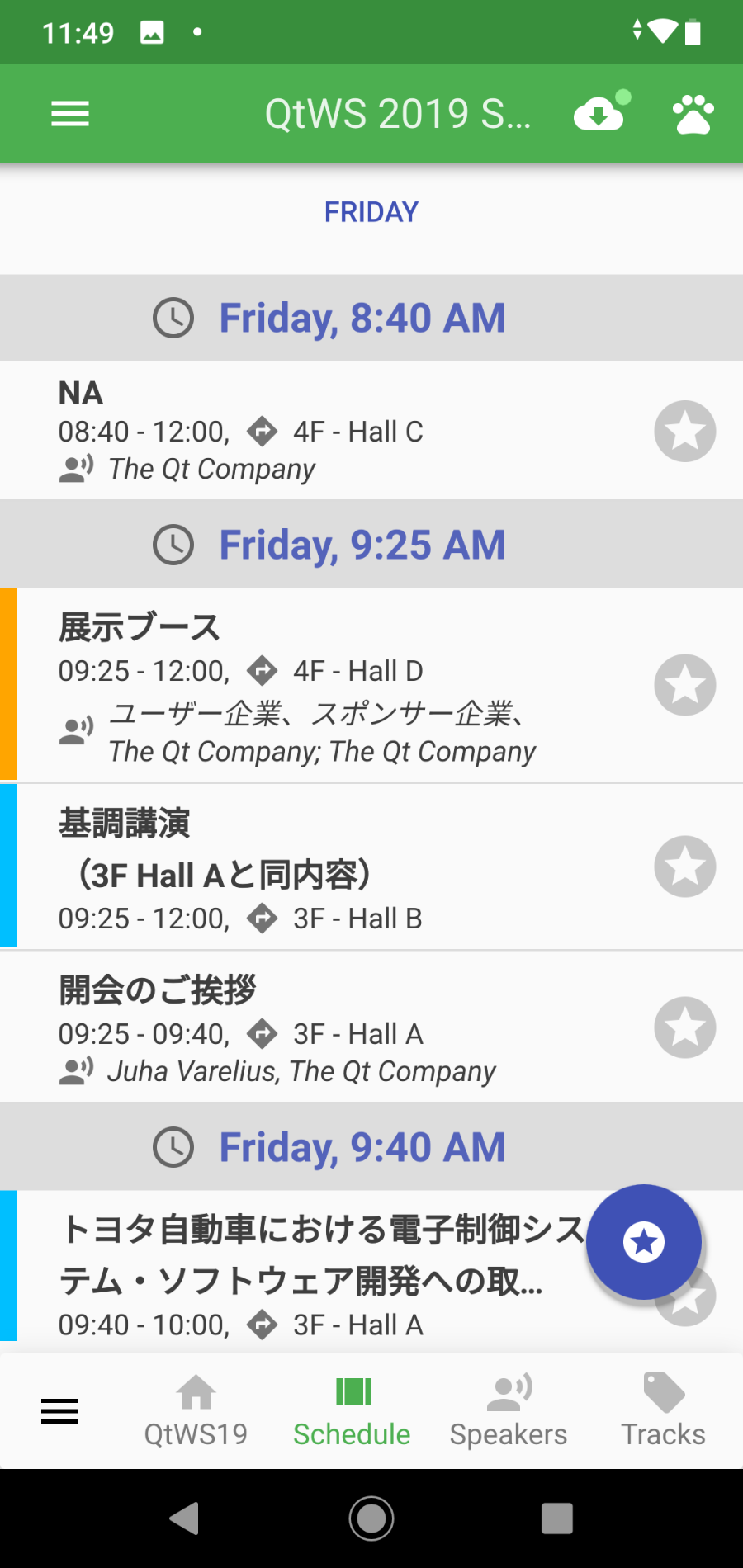
Conference Schedule is a SwipeView with pages for each Conference Day. The List of Sessions of a Day can be long, so there’s a ‘GoTo’ Button to jump to a specific Time Slot.

TimePicker is a customized UI Control I created with some help from Mitch Curtis.
Use this TimePicker to jump to Sessions starting at a specific time:

Personal Schedule (lists only marked Sessions). Easy toggling between Personal and Conference Schedule

Session Details:

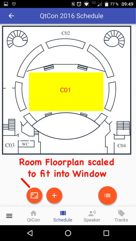
Room Floorplan – you can Zoom-In / Zoom-Out or Fit-To-Window:
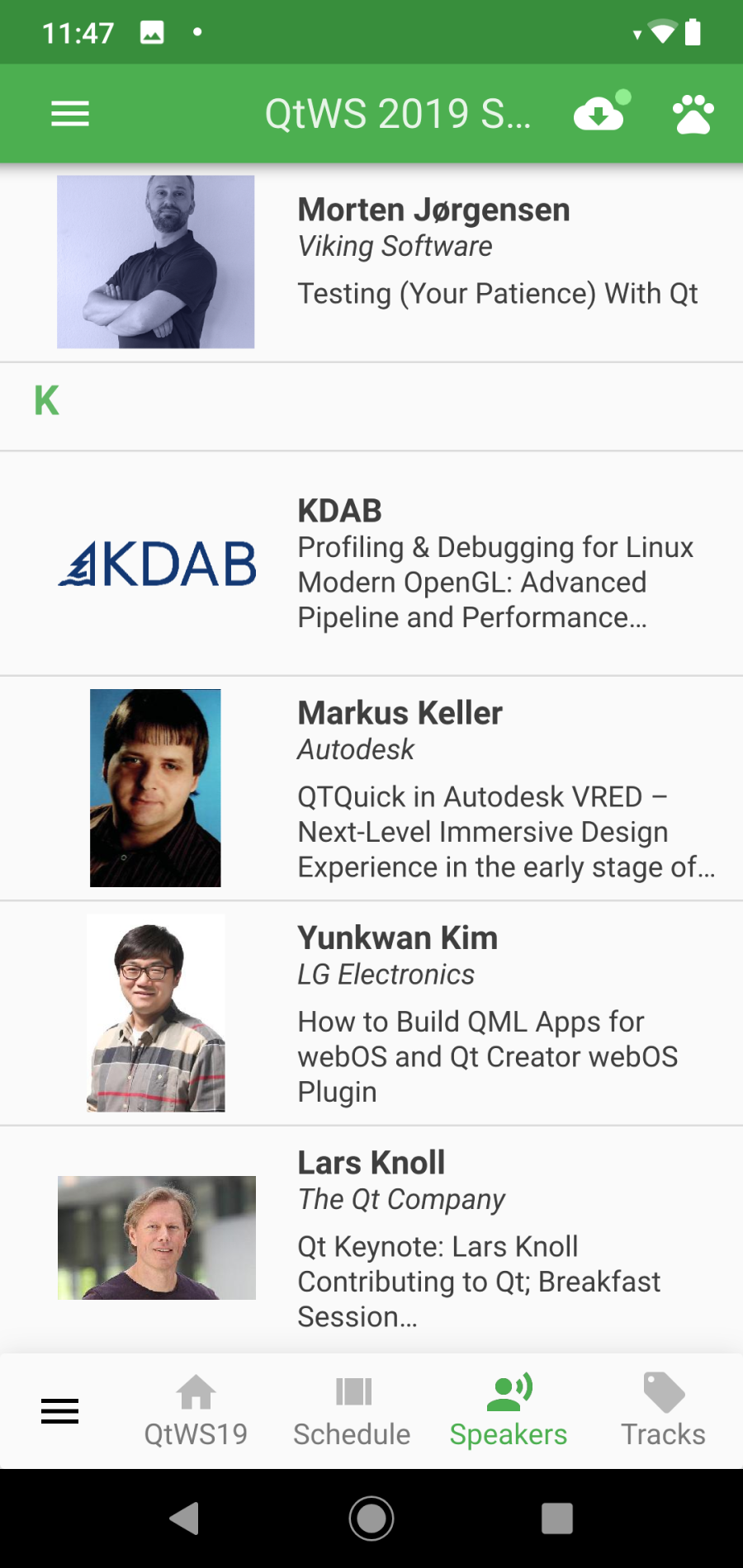
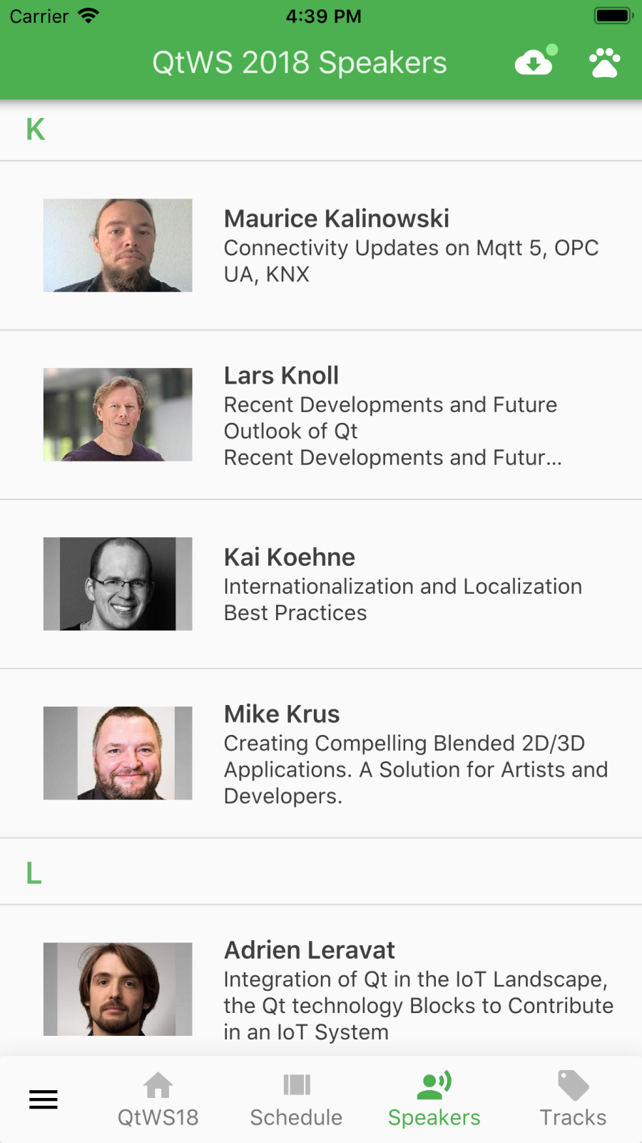
List of Speakers:
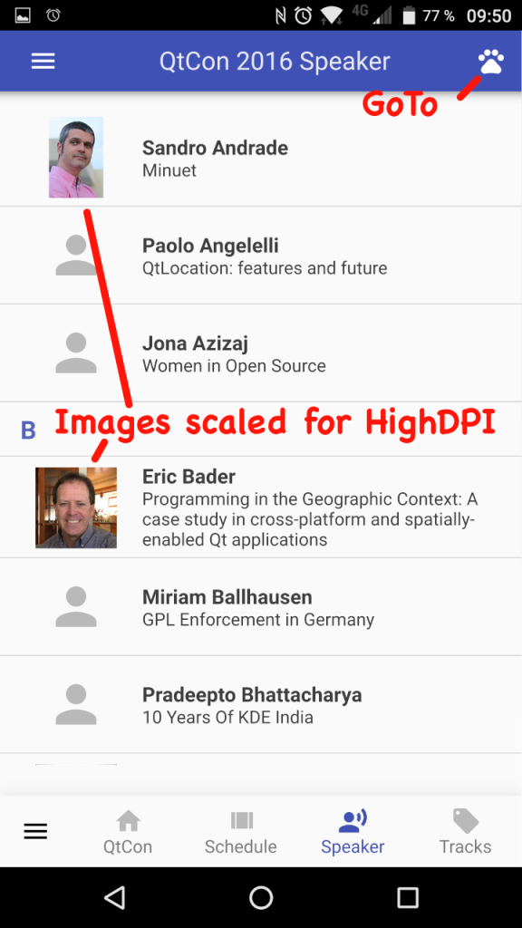
GoTo Speaker where Name starts with a specific Letter:

Speaker details

List of Tracks – in the meantime Tracks are colored to match UI from Web Browser.

Sessions per Track

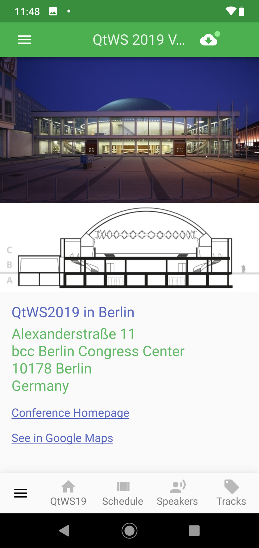
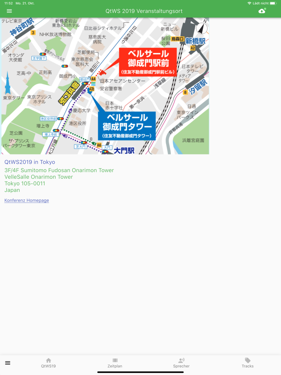
Venue Info
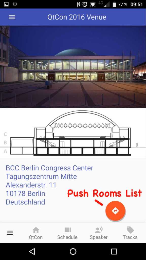
Venue Rooms List. Tap on a Room to see all Sessions or on the Thumbnail to see the Floorplan.

Sessions per Room

Help Page

About Page

Sources
This Application is Open Source and available at Github: https://github.com/ekke/c2gQtCon
Bugreports
As a good Open Source Project Citizen I always report Bugs and Requests.
Here are some of the Bugs I ran into while developing this APP:
TBD
Summary
I’m waiting for Feedback from QtCon in Berlin to see what could be done better.
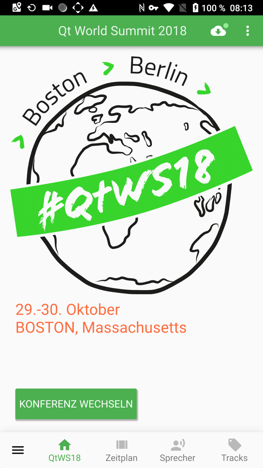
Next Conference App will be for Qt World Summit 2016 in San Francisco.
My personal wishlist for upcoming Qt Conference Apps:
- Integration with Twitter, Browser, Map
- Having Bookmarks and Favorites
- Personal Schedule Collision Detection
- From Session –> what’s running at Same Time
- Fulltext Search for Sessions and Speakers
- Update from Conference Schedule via Push
- Update Info (what’s new, removed, timeslots-rooms changed …
- Better Highlighting of List rows
- List of Sponsors
- Shortcuts for BlackBerry PRIV
- Jump to NOW while Conference running
- Remove short Flicker at Android Startup
- Pinch && Zoom Overview as I did for Cascades
- TimePicker with AM PM support
- TimePicker better resizing small screens
- Translate into more languages
- Support of Android Tablets and iPads
- …
Stay tuned for more Apps – next one will be for Qt World Summit 2016 in San Francisco.

…
→ Next Article (Qt World Summit Conference APP-TBD-)


 business apps